The following is an extract from Crystal’s online book – Modern Colour Workshop.
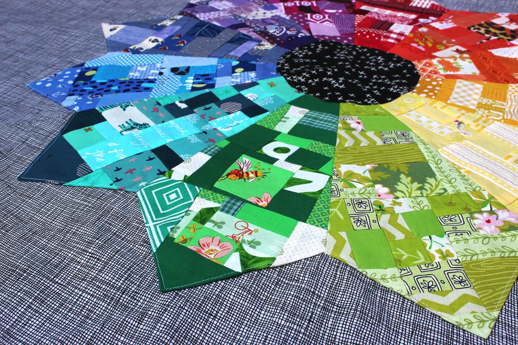
The book covers the essentials of colour theory and explores how it relates to choosing fabrics for your quilts. You will learn about colour relationships and why they matter; how to curate a colour palette using a variety of techniques; and the pattern to make your own colour wheel quilt.

Colour basics
All colours are not created equal. Have you ever tried to match a colour from an online shop, or in your local quilt shop without the original swatch? It rarely works. Red is a great example. Wander around your local quilt store and you will discover that there are many, many different reds out there. Some are rusty while some are almost purple. Some reds are even pink!
Each colour can be a different tint, shade, saturation and still be called red. The following are the key components that help us define a colour.

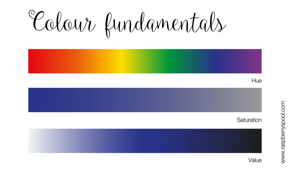
Hue – This is simply your colour’s name. This is how we describe the hue, for example, red or orange.
Saturation – A representation of how saturated, or rich a colour is. Low saturation equals less colour overall and the hue will eventually become grey when fully desaturated.
Value – The lightness or darkness of a colour. The higher the value, the closer the colour is to white. The closer to black the colour is, the lower the value. The value scale shows how the blue starts as a light, pastel blue (high value), and moves through to a darker, navy blue (low value).
Tints, shades and tones – When mixing colours, you can lighten or darken a hue with white, grey or black. A tint is a colour with white added and a shade is a colour with black added. A tone is created by adding grey, which reduces the colours saturation.

Colour relationships
Colour relationships are great ways of choosing colours that relate to each other and will look good together. There are many colour relationships that are well known and will work almost every time.
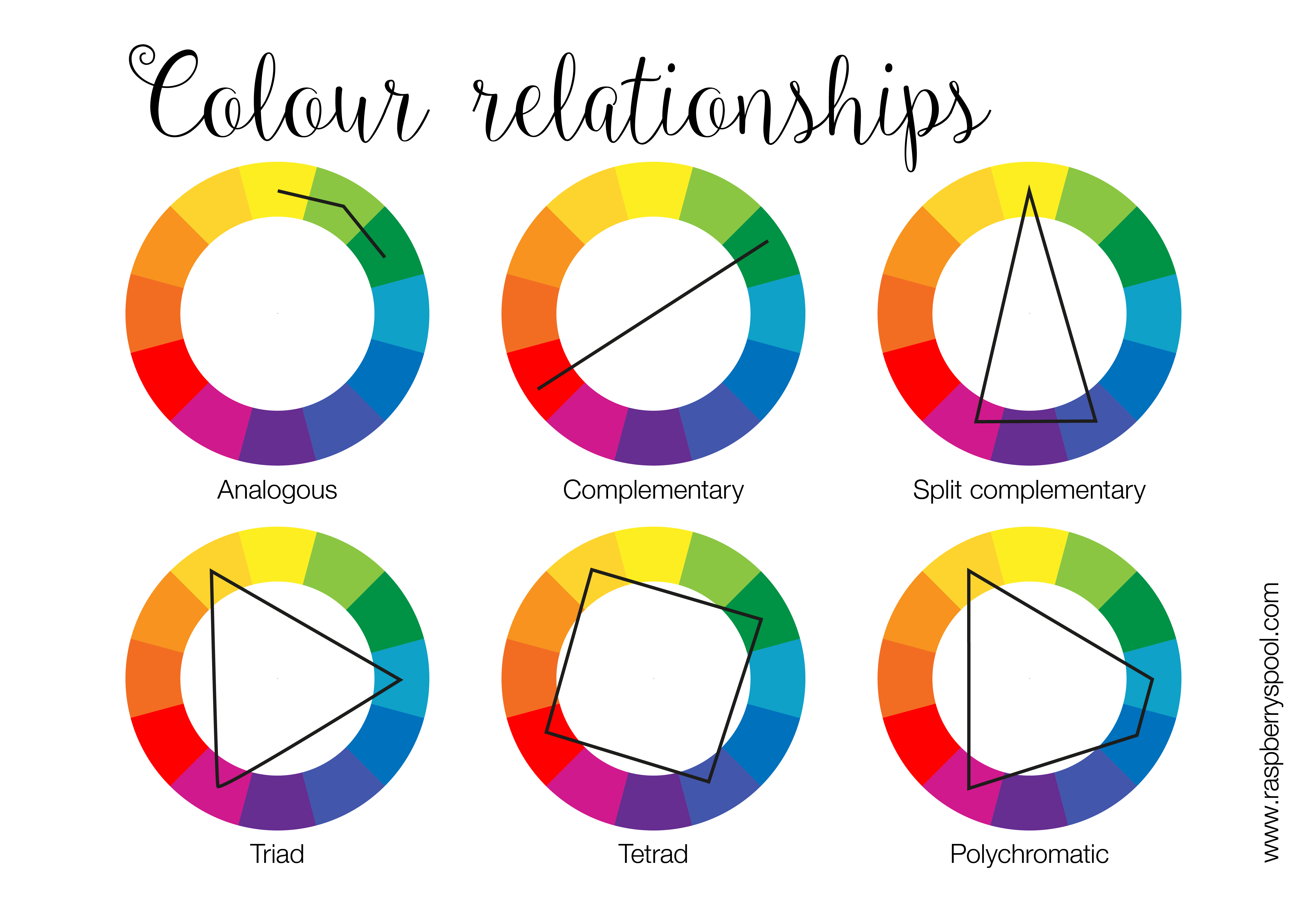
Analogous – Analogous colours sit next to each other on the colour wheel. This relationship is harmonious as the colours used are blended as the colours flow into each other.
Complementary – Two colours that sit opposite on the colour wheel. They are highly contrasting and clash big time, which lends itself to a powerful pairing. When you want to show off a colour, using the opposite colour for emphasis.
Polychromatic – The opposite of monochromatic, polychromatic an explosion of colour – think scrappy, random or all the colours. There is no reason or methodology behind the scheme, just happy accidents.

Creative exercise – build a fabric palette
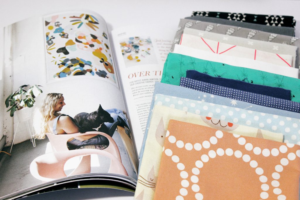
Build a fabric palette from a picture that you can use to make your quilt. The picture you use can be of anything, but one that speaks to you and has visual interest through colour. Have a look through fashion magazines, artworks or even your Pinterest feed.
Examine the image closely and determine which colours you see as important, not necessarily dominant. Can you identify a colour relationship in the colours you can see? Are there colours that speak to you, but you only see a hint of? Is it an accent colour? Choose up to nine different colours, which can be variations of colours and translate these into fabrics. What did you learn from this exercise?
Which colour do you see first? Second? Third? After 10 minutes? Where there any colours that you found dominated the picture? Did the fabrics in your stash influence the final outcome?
Modern Colour Workshop
Up your colour game with the Modern Colour Workshop ebook!
The Modern Colour Workshop ebook covers the basics of colour theory and explores how it relates to choosing fabrics for your quilts. You will learn about colour relationships and why they matter, how to curate a colour palette using an inspiration source, find a way to use that ‘ugly’ fabric.